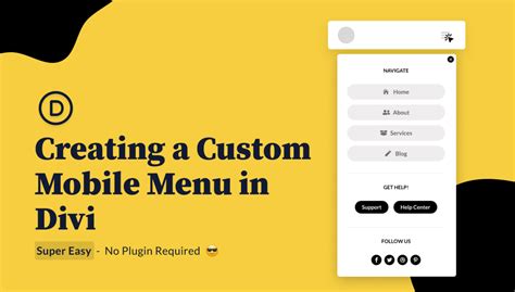
Wider Divi Mobile Menus for Better Conversions
Divi's mobile menu, while functional, often presents a usability challenge. Its narrow width can lead to frustrating navigation, impacting user experience and, ultimately, conversion rates. This article explores why wider Divi mobile menus are crucial for boosting conversions and provides practical strategies for achieving this improvement. We'll delve into the reasons behind this, exploring the user experience, and offering solutions for implementation.
Why Narrow Mobile Menus Hurt Conversions
Let's face it: squinting at tiny text on a smartphone is nobody's idea of a pleasant online experience. A narrow Divi mobile menu contributes to this problem, forcing users to painstakingly tap small links, increasing the likelihood of errors and accidental selections. This frustrating experience often leads to:
- Increased Bounce Rate: Users quickly abandon websites with difficult-to-navigate menus.
- Lower Engagement: A poor mobile experience discourages users from exploring your website further.
- Reduced Conversions: If users can't easily find what they need, they're less likely to complete a purchase or sign up.
Essentially, a poorly designed mobile menu directly impacts your bottom line. A wider menu significantly mitigates these issues.
How to Create a Wider Divi Mobile Menu
There are several effective strategies to broaden your Divi mobile menu and improve the user experience:
1. Utilizing Divi's Built-in Options (Limited Effectiveness)
Divi offers some limited customization within the theme options. While you can adjust the font size, you can't directly control the overall width of the menu. This approach offers minimal improvement and often isn't sufficient to address the core issue.
2. Custom CSS: The Most Effective Solution
Employing custom CSS offers the most control and flexibility. By adding a few lines of CSS code to your Divi theme's custom CSS area (or via a child theme), you can significantly widen your mobile menu. Here's an example:
@media (max-width: 767px) {
  .et_mobile_nav_menu {
    width: 90vw !important; /* Adjust the percentage as needed */
    left: 5vw !important; /* Adjust left margin for centering */
  }
}
This code targets the mobile menu's container and adjusts its width to 90% of the viewport width (vw). The !important flag ensures the custom CSS overrides Divi's default styling. The left property helps to center the wider menu. Remember to adjust the percentage values to find the optimal width for your specific design.
3. Using a Divi Builder Plugin (Third-Party Options)
Several plugins enhance Divi's functionality. Some of these offer more granular control over the mobile menu's appearance, potentially providing options to adjust its width without direct CSS modification. Always research and choose reputable plugins from trustworthy sources.
4. Testing and Iteration
Regardless of the method you choose, it's crucial to thoroughly test the mobile menu on various devices and screen sizes. Adjust the CSS or plugin settings as needed to ensure optimal functionality and a visually pleasing experience. User testing, if feasible, can be incredibly beneficial in identifying any remaining issues.
Addressing Specific User Concerns: Frequently Asked Questions
Here we tackle common questions related to optimizing Divi mobile menus for better conversions.
How does a wider mobile menu improve user experience?
A wider mobile menu significantly improves readability by allowing for larger text and more comfortable tap targets. This reduces errors and frustration, leading to a more positive user experience.
Can I use images in my wider mobile menu?
While it's technically possible, using images within the mobile menu can clutter the experience and negatively affect usability. Focus on clear text and intuitive navigation for optimal results.
What are the potential downsides of excessively wide mobile menus?
An excessively wide menu can lead to horizontal scrolling, which is just as frustrating as a narrow menu. Finding the right balance between width and usability is key.
Conclusion: Prioritizing Mobile User Experience
A wider Divi mobile menu is not just an aesthetic enhancement; it's a crucial step towards improving your website's conversion rate. By implementing the strategies outlined above, you can create a more user-friendly mobile experience, leading to increased engagement and ultimately, higher conversions. Remember to test, iterate, and refine your mobile menu design to meet the specific needs of your audience. A well-designed mobile experience translates directly to a more successful online business.

