Improve Divi Shop Design: Add to Cart Button Placement
Divi's flexibility is a boon for e-commerce, but its power can also lead to design dilemmas. One common challenge? Optimizing the placement of your "Add to Cart" button for maximum conversions. A poorly placed button can significantly hinder sales, while a strategically positioned one can dramatically boost them. This article explores various approaches to improve your Divi shop design by focusing on strategic "Add to Cart" button placement. We'll cover best practices, common mistakes, and answer frequently asked questions to help you maximize your online store's potential.
Understanding the Importance of Add to Cart Button Placement
Before diving into specific placement strategies, let's understand why button placement is so crucial. Your "Add to Cart" button is the ultimate call to action (CTA) on your product pages. Its visibility and accessibility directly impact your conversion rate. A hidden or awkwardly positioned button can lead to frustrated customers and lost sales. Conversely, a prominent, easily accessible button encourages immediate purchases and improves the overall shopping experience.
Best Practices for Add to Cart Button Placement
Several strategies can significantly improve your "Add to Cart" button's effectiveness:
-
Above the Fold: Ensure your button is visible without requiring the user to scroll. This prime real estate is crucial for capturing attention immediately.
-
High Contrast: The button should stand out visually against the background. Use contrasting colors to make it easily noticeable. A strong color choice, distinct from the surrounding elements, will draw the eye.
-
Clear and Concise Button Text: Avoid ambiguous phrases. "Add to Cart," "Buy Now," or "Add to Bag" are all clear and effective options.
-
Strategic Visual Hierarchy: Use size, color, and whitespace to emphasize the button and guide the user's eye towards it. The button should be the most visually prominent element on the page after the product image.
-
Accessibility: Ensure the button is easily accessible to users with disabilities. Proper ARIA attributes and sufficient size are vital.
-
A/B Testing: Continuously test different button placements and designs using A/B testing to determine what works best for your specific audience and products.
Common Mistakes to Avoid
Several common mistakes can sabotage your "Add to Cart" button's effectiveness:
-
Burying the Button: Hiding the button within a cluttered layout makes it difficult to find. Ensure sufficient whitespace around the button to give it breathing room.
-
Using Unclear Button Text: Vague phrases can confuse users and lead to hesitation. Always use clear and direct language.
-
Poor Color Choice: A button that blends into the background is easily overlooked. Ensure strong contrast to make it pop.
-
Small or Hard-to-Click Buttons: Tiny buttons are difficult to click on mobile devices. Ensure adequate size for easy interaction.
Frequently Asked Questions (FAQ)
Where is the best place to put my Add to Cart button on a Divi product page?
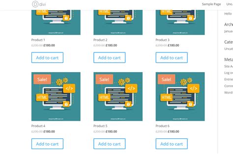
The ideal placement is usually below the product image and its description, but above the fold. A/B testing different positions within this area is crucial to optimize for your specific audience.
What color should my Add to Cart button be?
There's no single "best" color. The most effective color depends on your brand's color scheme and the overall design of your website. However, colors that create strong contrast with the background are generally more effective.
How big should my Add to Cart button be?
The button should be large enough to be easily clicked, even on mobile devices. Aim for a minimum size that ensures comfortable interaction for all users.
Should I use multiple Add to Cart buttons on a product page?
While you might consider placing one at the end of a long page for ease of access for users who've already read everything, too many buttons can be visually distracting. One strategically placed button is usually sufficient.
How can I track the effectiveness of my Add to Cart button placement?
Use analytics tools like Google Analytics to track your conversion rate. Compare conversion rates before and after changing your button placement to determine the impact of your changes.
Conclusion
Optimizing your "Add to Cart" button placement in your Divi shop is a crucial aspect of improving your conversion rate. By following best practices, avoiding common mistakes, and continuously A/B testing, you can significantly increase your online sales. Remember, user experience is paramount, so design with your customers in mind. A well-placed button isn't just about aesthetics; it's about guiding your customers towards a successful purchase.

